Job: Branding and Packaging for NZ Heritage Honey
Client: Heritage Honey
Branding and Packaging for NZ Heritage Honey
The Opportunity
MSO Design was approached to collaborate with local honey producers, Heritage Honey, with a primary focus on exporting their product to Asian markets. New Zealand Manuka Honey enjoys significant popularity in Asia due to its perceived health and wellness benefits. This collaboration presented MSO with an opportunity to demonstrate our creativity and branding expertise by designing packaging and marketing materials tailored for an overseas market, posing a unique challenge for our team.
Our Solution
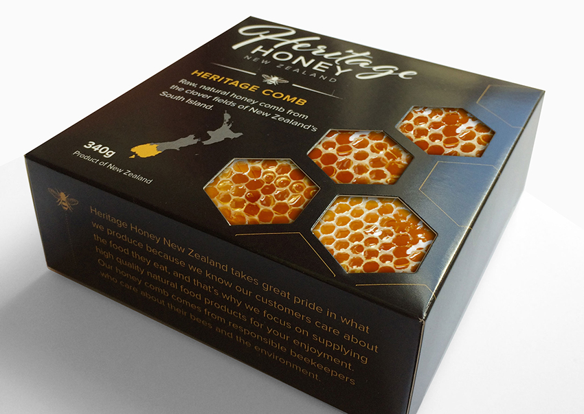
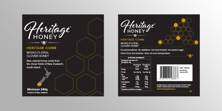
After conducting thorough market research and gaining insights into the target demographic, our design team developed a distinctive packaging design featuring a honeycomb die-line to effectively showcase the product within its packaging. The design aimed to highlight the honey’s natural origins and premium quality. Utilizing a combination of gold and black colours, the packaging conveyed luxury, positioning the brand within the premium product category while aligning with cultural perceptions prevalent in Asian markets. Drawing on our knowledge and understanding of the packaging and labeling requirements within these target markets, we expedited the process to ensure the product was ready for a swift market entry.
The Outcome
The outcome was a visually captivating logo and packaging design that successfully conveyed authenticity and luxury, effectively distinguishing the brand in the market. With its visually striking appearance, the brand stood out amongst its competitors, garnering attention and interest from consumers. This strategic branding initiative positioned Heritage Honey Comb as a premium offering, enabling them to carve out a distinct identity and establish a strong presence in the competitive Asian market.